LANEIGE MEETS ARTS SAGMEISTER & WALSH
← Swipe left or right →


-
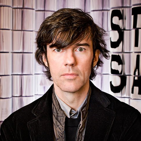
Stefan Sagmeister
A living legend in the world of design who has made the most
groundbreaking artworks
across genres such as fine arts, visual design,
graphic design, typography,
and exhibition openings. -
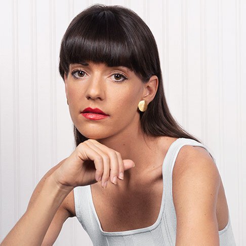
Jessica Walsh
Creating her own unique world of arts, Jessica Walsh is a graphic
designer
and creative director who has received distinctions such as
Forbes
‘30 Under 30’ and Ad Week’s ‘Top 10 Visual Creatives’.
-
Q. It is an honor to showcase your work with us! Would you please say
hi and introduce
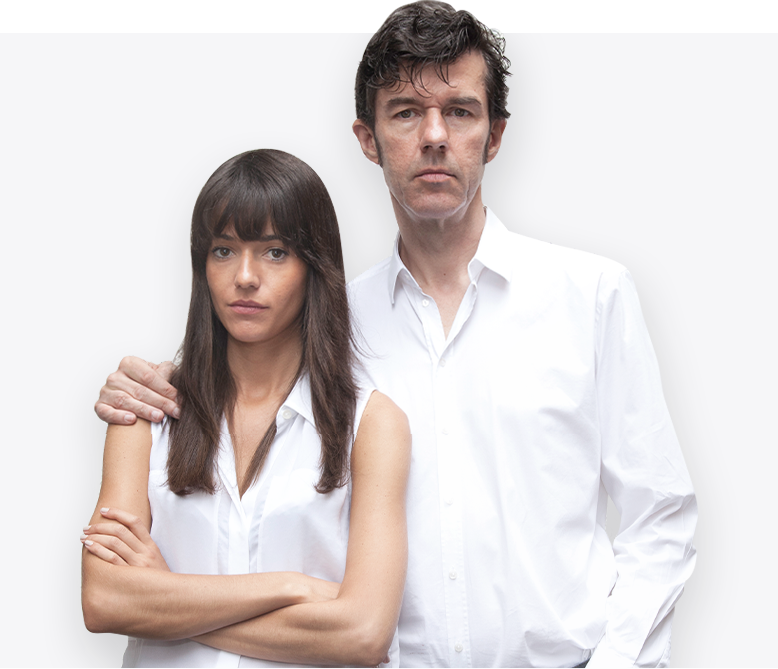
yourselves to the audience in Korea?Hi! We are Jessica Walsh & Stefan Sagmeister. We create work together under the name
“Sagmeister & Walsh.” In the last decade we’ve created identities, commercials, films, books
and objects for clients, audiences and ourselves. We have worked together on a large variety
of projects, some of which include the brand identity for The Jewish Museum based
in New York City, our self-initiated art exhibition & book The Beauty Show as well as
the branding and advertising for Middle Eastern department store Aїzone. -
Q. How did you feel and what was it like to first collaborate with ‘Laneige’?
We have different relationships with beauty products, so we both approached the
collaboration from a different angle. We find that our different life experiences make our
work stronger, as we bring different viewpoints to the table to create a more well-rounded
idea. We both believe in using firsthand experiences to guide the design process,
more so than mass user testing or testimonials.
-
-
Q. ‘Typography’ might be unfamiliar to some in Korea.
Could you please describe the art in one sentence?Typography is the art of letter & typeface formation through
craft & design. -
Q. What were your thoughts about the word ‘Laneige,’
since we were able to give meaning to each letter within that word?In English, Laneige is an extremely beautiful word. The sound & the letters
alike create an extremely ethereal feel, so we were excited to play with
the word. Each letter in Laneige has its own personality, so we were
able to show a unique visual experience for each letter. Through the
animations, colors & sounds, the videos bring the word Laneige
to life, giving the brand name a three-dimensional expression.
When the Laneige team shared their logo, monogram & brand colors
with us for the first time, we were very drawn to the simplicity &
elegance of the brand. The wordmark is beautiful & simple,
yet extremely modern & confident. The monogram is sophisticated &
pleasing to the eye, as it follows a perfect proportion of the golden ratio.
The silver, blue & black combined with the luminous gradient creates
a feeling of effortless movement.
-
-
-
Q. What was one of the things that you painstakingly had to do to express the beauty
of water?The element of motion was extremely important to express water across these videos.
Aside from clarity & purity, the many shapes of water are one of its most defining elements.
We worked very hard to express the different movements, attributes and shapes of water,
which required extreme precision and very talented designers. -
Q. Millennials today consume a plethora of content, especially visual. What are the
attitudes and mindsets that you hope for the audiences to have for this exhibition?As noted before, we want audiences to understand that these videos are not just videos that show up on social media platforms for quick entertainment. These are more than entertainment & beyond informational. They are meant to be a beautiful experience highlighting all senses, capturing the viewers full attention. We hope that Millennials can shift their typical video consumption patterns and slow down with each of these videos in order to have an individual experience across the exhibition.
-
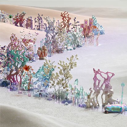
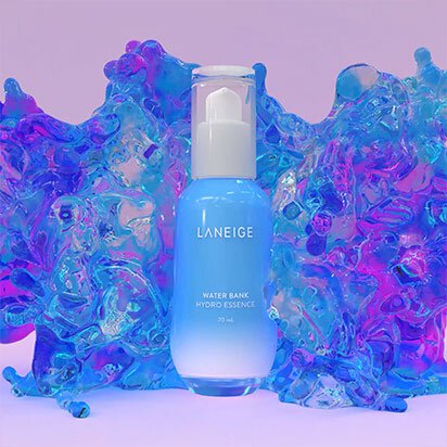
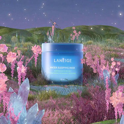
In 2021, the duo revealed a reinterpretation of LANEIGE’s
bestsellers that had been
woven into a form of digital art.
Our unique brand stories, product qualities to be highlighted
and the message LANEIGE wishes to share with the customers have been reinterpreted through this fresh
and artistic vision to offer a pleasant experience for our customers.
- Choosing a selection results in a full page refresh.

